
Most SaaS teams pile on new channels, new campaigns, and new growth experiments while the easiest wins sit unfixed on their own site. We see it on nearly every audit we run: a broken activation email here, a phantom secondary CTA there, a heading hierarchy that hurts SEO and accessibility, a funnel that takes four pages to do the job of one.
These aren't sexy fixes. They're afternoon-long jobs that compound into the kind of conversion lifts no growth hack delivers. The frustrating part is that founders usually know about most of these in the back of their head — they just deprioritize them because the fix doesn't feel ambitious enough. It's part of why CMOs are struggling right now: the temptation is to spend on new channels when the existing site has compounding fixes available.
Here's what we'd actually fix first if you handed us your site tomorrow. Eight tactics, split across marketing, design, and web dev — every one of them low-hanging fruit. (They map cleanly onto the second phase of our framework on the three phases of SaaS marketing — Base. If you haven't seen that piece, start there for context on where these fit in the broader sequence.)
Quick wins on the marketing side
Send a behavior-triggered email when users don't activate
The single most under-deployed thing in SaaS marketing is automated email triggered by the absence of a behavior. Not the welcome email when someone signs up. The email that fires when someone signs up and then doesn't do the most important action you need them to take.
A user signs up. They never connect their account, never invite a teammate, never finish the setup wizard, never send their first message — whatever the activation event is for your product. A trigger fires. They get an email that says something like: "Hey, you signed up two days ago but haven't connected your domain yet. Want a 10-minute call where I do it with you? Or here's a 90-second video showing exactly how to do it yourself."
Founders skip this because they assume their users are smart enough to figure out the setup on their own. But users aren't dumb — they're busy. The activation step is competing with twenty other priorities in their day, and one well-timed nudge gets you a meaningful chunk of users back.
The structure is simple: identify your activation event, build a trigger that fires when it hasn't happened within N days, and write one helpful email. That's it. We cover the full pattern (behavior triggers, sequences, templates, common mistakes) in our dedicated post on this: the onboarding email sequence most SaaS teams don't build.
Offer a migration service from competitors
The second under-deployed marketing tactic: actively help people switch from a competitor's tool to yours.
The usual pricing/comparison page CTA is some variation of "Start free trial" or "Book a demo." Both shift the work of switching onto the prospect. They have to figure out export formats, re-create their setup, move their data, retrain their team, and explain the switch to leadership. That's a lot of friction for "just try it."
A migration service collapses that. Two flavors work:
- Concierge migration — a real person on your team handles the move. You scope it on a call, run the import yourself, and hand them back a working setup. Best for higher-ACV products where the human cost is offset by the deal size.
- Automated migration — a button or scraper or import tool that does it for them. Best for lower-ACV products and PLG motions where scale matters.
Or blend the two: a button that handles the common case plus a "talk to a human" fallback for edge cases.
Once you have it, put it on every comparison page. "Switch from [Competitor] to [You] — we'll do the heavy lifting." That single CTA closes deals that "Start free trial" never would.
Quick wins on the design side
Keep your primary CTA visually consistent across the entire site
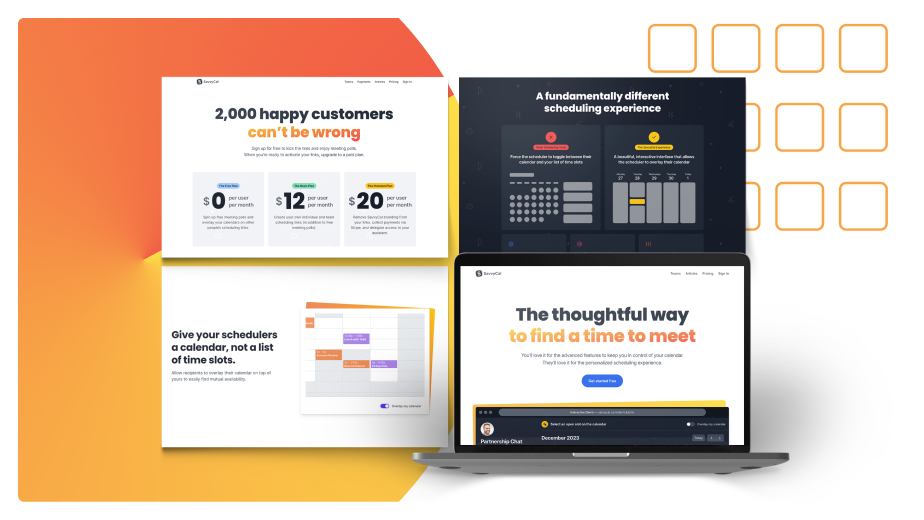
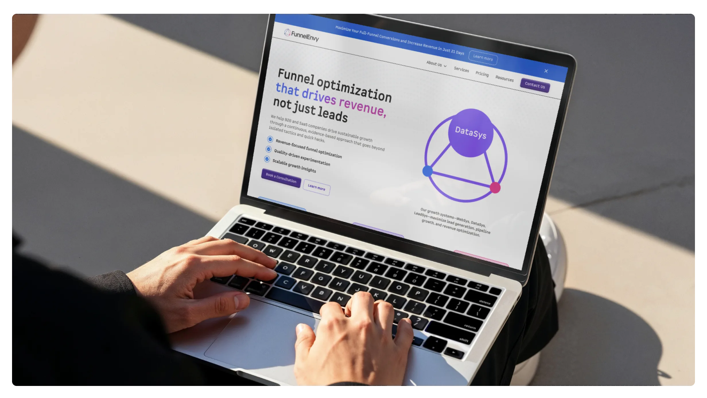
A primary CTA on your homepage that uses one shape, one color, and one copy convention should look like the same primary CTA on your pricing page, your features page, your blog header, and your sales pages. Same shape. Same color. Same family of copy verbs.
What we see instead: a homepage CTA that's a gradient button with "Get started," a pricing CTA that's an outlined button with "Try it free," a blog header CTA that's a text link with "Sign up," and a features page CTA that's a different gradient button with "Start your trial." Four different visual treatments for the same conversion action.
The cost is twofold. First, the visual inconsistency erodes trust — it's one of the symptoms of bad branding that's so common most teams stop noticing it. Users feel something is off without knowing why. Second, A/B testing becomes nearly impossible because you're testing button design as much as message. Pick one primary CTA visual language and use it everywhere. The fix is two hours of design audit and one developer afternoon to make components consistent.
Use shaded versions of your main color for secondary text, not random accents
For secondary or tertiary text (helper copy, captions, metadata, footnotes), the rule of thumb is to use a lighter or darker version of your primary text color — not a third color from your palette.
On a dark background with light text, secondary text should be a slightly dimmer version of that light. On a light background with dark text, secondary text should be a slightly muted version of that dark. Not blue, not orange, not whatever your accent color is. The same color, dialed back enough that it reads as secondary but not so dimmed that it fails accessibility contrast.
Founders pick a random accent color for secondary text because they think it adds visual interest. It doesn't — it adds noise. The hierarchy gets murky and the page reads as cluttered. A single text color with two or three opacity steps reads as designed; multiple accent colors read as DIY.
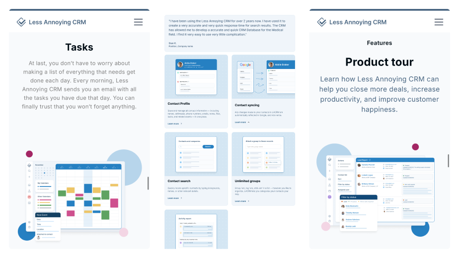
Stop using product screenshots — record short videos instead
Screenshots of your product on a marketing page are almost always worse than a short Loom or Screen Studio recording of you using the feature.
Screenshots are static. They miss the motion that makes the product feel alive. They go stale the instant you ship a UI tweak. They're hard to compose well at the resolutions modern displays render at. And — most importantly — they don't show how the product works, which is exactly what a prospect needs to understand before they'll try it.
A 15-second screen recording of someone clicking through the feature solves all of that. You can shoot one in five minutes with Screen Studio (Mac) or a quick Loom (anywhere). The compression is better, the perceived production value is higher, and the prospect actually sees the product move.
If you've got product screenshots above the fold on your homepage right now, replace one with a short recording this week. The lift in trial signups is meaningful.
Quick wins on the web dev side
Get your heading hierarchy right
Heading hierarchy is the single most-broken thing on SaaS marketing sites. One H1 per page. Nested H2s under the H1. Nested H3s under those H2s. That's it. That's the rule.
What we see instead: pages with three H1s because the designer wanted three large headlines and the developer used <h1> to make them big. Pages where every section header is an <h2> regardless of nesting. Pages with H4s and H5s that skip H3 entirely. Pages built in Framer where the framework actively makes correct hierarchy harder (more on that in a second).
The cost is real. Search engines and AI search models (ChatGPT, Claude, Perplexity, AI Overviews) use heading structure to understand what a page is about and what sections cover what. A broken hierarchy makes your content harder to rank and harder to get cited. Accessibility tools (screen readers) also navigate by headings — a bad hierarchy makes your site harder to use for anyone relying on assistive tech.
We cover the full fix (correct hierarchy rules, common mistakes, Framer-specific issues, blog post formatting) in our dedicated post on h1 h2 h3 SEO and why most SaaS sites get heading hierarchy wrong.
Format your blog posts like the rest of your site
Even if your marketing pages have correct heading hierarchy, your blog content usually doesn't. Content writers come in, use the editor, and either don't know the heading rules or assume the template handles it. They use bold paragraphs instead of H2s. They drop in H1s thinking it makes the section feel important. They skip levels because the editor preview looks fine.
Blog posts are usually the highest-volume content on your site — they're what ranks for long-tail keywords, what gets cited by AI search, and what brings inbound traffic. Bad heading hierarchy in the blog hurts more than bad hierarchy on a marketing page because the blog is the SEO surface area.
The fix is process: a one-page editorial standard that says "H1 is the article title (the template handles it). H2s are major sections. H3s are sub-sections within a major section. Don't use H4+." Anyone writing for your blog reads it before publishing. Done.
Collapse multi-page funnels into single-page experiences
If your funnel requires four pages of clicking to convert, you're losing customers at every transition. The classic ecommerce affiliate funnel pattern shows this clearly: email captured on page 1 → video on page 2 → course page on page 3 → checkout on page 4. Each transition is a bailout point. By page 4, you've lost most of the audience that started.
SaaS does a version of this too: homepage → features page → pricing page → demo request form → calendar booking. Every page is another opportunity for the prospect to close the tab.
The fix is to collapse what you can. If the features content is essential for conversion, fold it into the homepage as a scroll section. If the pricing page is where decisions happen, make the demo form inline rather than a separate page. If the demo booking is the conversion event, embed the calendar directly on the pricing page so the prospect goes from "interested" to "scheduled" without a page transition.
Not every funnel can collapse to one page — sometimes the multi-step pattern is right (longer sales cycles, enterprise deals, complex products). But most SaaS sites have one or two unnecessary transitions that are quietly costing them conversions.
So which one should you fix first?
Look at your funnel. The fix with the highest leverage is almost always one of these three:
- Onboarding email triggers — if you have signups not converting to active users, this fix has the highest ROI of anything on this list. It's an afternoon of work and can lift activation by double digits.
- Heading hierarchy — if you care about SEO or being cited by AI search, fixing your hierarchy moves you up rankings for everything you already publish. It compounds.
- CTA consistency — if your conversion rate on cold traffic feels low, audit your CTAs across every page. Inconsistency at this level is invisible-but-real friction.
The other five are still worth fixing. They're just lower on the ROI ladder for most teams. Pick the one above that maps to your weakest funnel stage and ship the fix this week.
The discipline here matters more than the specific tactic. Most teams know about most of these. The teams that grow are the ones who actually do them.
Frequently asked questions
"We're a tiny team. Which one of these eight should we do if we can only do one?"
Behavior-triggered onboarding emails. The activation-to-paid conversion improvement compounds month over month and the cost is one afternoon of email automation work plus one well-written email. Nothing else on this list returns ROI as fast for a small team. Once that's in place, work down the list from there.
"Our funnel is already a single page. Why is the funnel-collapse tactic on this list?"
Because most teams think their funnel is single-page when it isn't. The marketing site collapses to one page, but the conversion event (demo, signup, trial) lives in a different flow that adds two or three more transitions. Count every page a prospect touches between landing on your site and giving you their credit card or booking a call. If that number is greater than two for cold traffic, there's almost always a transition you can collapse.
"Won't switching to videos over screenshots blow up our page weight and hurt Core Web Vitals?"
Not if you do it right. Use the loaded-on-scroll pattern: the video doesn't load until the user scrolls to it. Use compressed formats (MP4 with H.264, or WebM). Cap clip length at 15–30 seconds for product demos. A well-compressed 20-second clip is usually under 2MB — well within Core Web Vitals budget. If page weight is the concern, the screenshot-vs-video tradeoff isn't actually a tradeoff. It's a smaller PNG vs a smaller MP4 with much higher conversion impact.
"Migration services sound expensive. How do agencies that don't have unlimited engineering build them?"
The first version is usually concierge, not automated. A founder or success rep gets on a 30-minute call with the prospect, walks them through the export-from-competitor and import-to-you steps, and ships the working setup themselves. No code required. You're spending an hour of human time to close a deal that wouldn't have closed otherwise. Once the migration request volume justifies engineering, you build the automated version. Don't start with the automated version — start with the concierge version this week.
"Doesn't the AI search heading-hierarchy point apply to every page, not just blog content?"
Yes. The marketing pages matter too. The reason we called out blog content separately is that marketing teams usually audit and fix their marketing pages once, then forget about them. Blog content gets added continuously by content writers who often don't know the heading rules. The fix on marketing pages is a one-time audit. The fix on blog content is process. They're different work even though the underlying rule (one H1, nested H2/H3) is the same.
"We've heard the 'low-hanging fruit' framing before. What makes this list different from every other listicle?"
Most "easy wins" listicles recycle the same five tactics (write better headlines, add testimonials, use scarcity, optimize CTAs, simplify pricing). These eight are different because they're the ones we actually see broken on nearly every SaaS site we audit — and they're the ones with the highest dollar-per-hour return when we fix them. We picked them based on what moved the needle for our agency clients, not what makes a clickable listicle title.