
When a SaaS buyer is fifteen minutes from picking a tool, they don't search for "best CRM." They search for "Salesforce alternatives" or "HubSpot vs Pipedrive." Those are the highest-intent queries in the entire buying journey. If you don't have a page targeting them, your competitor does — and now the AI tools that increasingly mediate these decisions are citing their page when describing the trade-offs. A competitor comparison page is the single most valuable piece of SEO real estate most SaaS founders never build.
This post is the framework: why comparison pages matter more now than they ever have, the four formats that actually work, how to write them without bashing competitors, the design rules that keep them on-brand, and the positioning foundation that makes the whole thing trivial to execute. By the end you should be able to spin up at least one comparison page this week.
Why competitor comparison pages matter more in the AI era
In the pre-AI search world, "competitor comparison" was a known SEO play but optional. The reader hit Google, scrolled through a few results, and made up their mind. If you had a comparison page, great — it was one of ten links on page one. If you didn't, the reader read a competitor's page, or a review-site post, or a Reddit thread. You lost some narrative control but the trade-off was tolerable.
That world is gone. When a buyer asks ChatGPT, Claude, Perplexity, or Google's AI Overviews "is Notion better than ClickUp?", the model isn't surfacing ten options — it's synthesizing one answer. That synthesis pulls from whatever structured content the model has crawled. If your competitor wrote a "Notion vs ClickUp" page and you didn't, the model summarizes their argument. The reader gets the competitor's framing of the trade-off and an implicit recommendation toward the competitor's product.
This is the biggest under-discussed shift in SaaS SEO. AI search needs structured content, and it pulls that content disproportionately from the primary parties — meaning you and your competitor. Third-party reviews matter less now. Aggregator content matters less. The structured comparison content on your own marketing site matters dramatically more, because the AI is parsing it as authoritative source material and citing it.
The asymmetric outcome: if you have a comparison page and your competitor doesn't, the AI cites you. If your competitor has one and you don't, the AI cites them. If both of you have one, the AI compares both and the reader gets a balanced picture — which is fine, because at least you're in the conversation. The worst outcome is being silent while your competitor controls the narrative.
This applies even when the search isn't direct comparison. A query like "best calendar tool for sales teams" pulls AI Overviews content from whatever the model has indexed about each candidate. Your comparison pages contribute structured fact-checking that the model uses to evaluate the relative merits of each option. The compounding effect over hundreds of queries is meaningful.
The four formats that actually work
There are four distinct comparison page formats. Each has a different SEO intent, a different difficulty curve, and a different fit for where you are in your marketing maturity. Most SaaS teams should start with the lowest-friction format and add others over time.
Format 1 — "Alternative to [Competitor]"
The lowest-hanging fruit and the format most teams should start with. The page lives at /alternatives/calendly or /calendly-alternative and targets the query "Calendly alternative" or "alternatives to Calendly."
The brilliance of this format is that you don't have to do a comparison at all. You're not putting your product head-to-head with the competitor on a feature checklist. You're addressing a reader who has already decided they want to leave the competitor (or are considering it), and you're explaining why you're a good alternative — in your own voice, on your own terms, without bashing anyone.
The structure of a strong alternative-to page:
- Hook: validate the reader's frustration with the named competitor in a way that doesn't sound mean-spirited ("If you've outgrown Calendly's three-meeting-type limit, you're not alone...")
- Your positioning: what you do differently, in plain language. Not "we have features X, Y, Z" — "we built this for people who do A, who care about B"
- Specific concrete differentiator: one or two things your product genuinely does that the competitor doesn't (or does poorly)
- Voice of customer: quotes from real switchers explaining why they moved. These are gold because the reader sees themselves in the quotes.
- Easy onramp: an offer that lowers the cost of switching — migration help, a free trial without a credit card, a guarantee. Switching costs are real; if you can lower them, you should
- A clear next step: book a demo, start a trial, talk to sales — match the offer to your motion
Notice what's missing: a feature checklist. That's deliberate. The alternative-to format doesn't need one. The format works because it captures high-intent searchers (people specifically looking to switch) and gives them a soft landing on your positioning. The deeper comparison happens in the next format if they want it.
Format 2 — "Alternatives to [Competitor]" (plural)
A roundup page listing 5-10 alternatives to a competitor, including yourself. The page lives at /calendly-alternatives and targets "best Calendly alternatives" or "top Calendly alternatives."
This format is harder to win because it competes against editorial review sites (G2, Capterra, Software Advice, TechCrunch listicles) that have spent years optimizing this exact format. You can rank, but you need to do it credibly — actual reviews of competing products, honest pros and cons, not a thinly-veiled ad for yourself with eight token competitors.
The trade-off: this format captures readers earlier in the journey (still gathering options) and positions you as a credible source. The downside is editorial overhead — you have to keep the page updated as competitors change, and you have to give real estate to products that aren't yours.
Most early-stage SaaS teams skip this format and start with format 1. It earns its place when you have the editorial bandwidth to maintain it.
Format 3 — "[Your Product] vs [Competitor]"
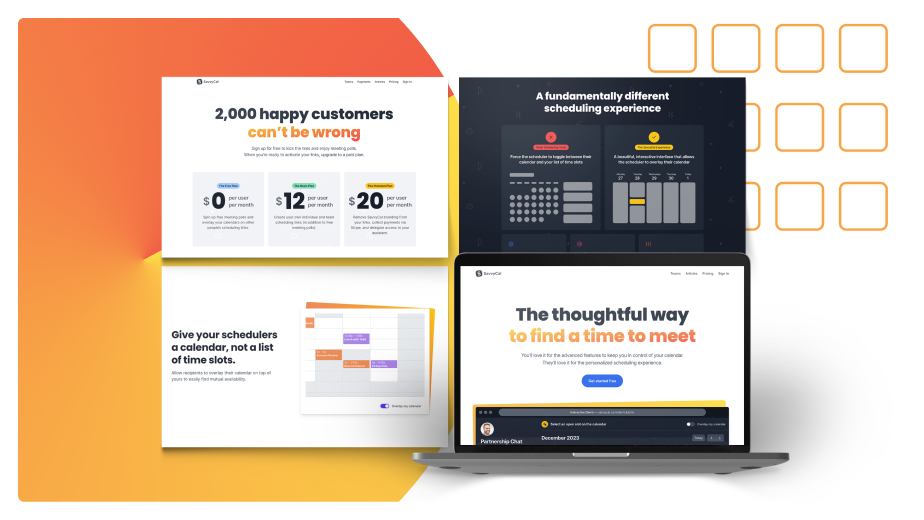
A direct head-to-head comparison. The page lives at /savvycal-vs-calendly and targets "SavvyCal vs Calendly" or the reverse.
This is the highest-intent format — the reader has narrowed it to two options and is doing final comparison. Conversion rates on these pages are typically the highest of any page on the marketing site (we routinely see 5-15% CTR to demo/signup on well-built versions), because the searcher is minutes from a decision.
The structure that works:
- A short fair summary of both products at the top — what each is best at, who each is for. Don't fake even-handedness, but acknowledge real strengths on both sides.
- A side-by-side comparison table covering the dimensions that actually matter for the decision (not just feature checkboxes — pricing model, primary use case, ideal user, integrations, support quality)
- A deep dive on the 2-3 dimensions where you're genuinely better, with screenshots and specifics
- A short honest section on the dimensions where the competitor is better or even — this is the part that builds trust and signals you're not trying to manipulate
- Voice-of-customer quotes from people who switched from the competitor to you
- A clear next step
The thing that wrecks these pages is the comparison table. We'll come back to it.
Format 4 — "[Competitor A] vs [Competitor B]"
A comparison between two products, neither of which is yours. The page lives at /notion-vs-clickup and targets "Notion vs ClickUp" with you appearing as a third option ("but if you don't like either, here's another approach").
This is the most editorial-heavy format and the hardest to do well. The payoff is that you reach readers who haven't yet considered your product at all — they're choosing between two competitors and you insert yourself as a third path.
Reserve this for when your product is genuinely a category-adjacent alternative (not a direct replacement). Notion can credibly run a "Asana vs ClickUp" page where they appear as the all-in-one alternative. A pure project-management tool can't — they'd be a fourth project-management tool in a project-management comparison, which is structurally weaker.
Start with format 1 and do them all
The right answer to "how many comparison pages should we have?" is: all of them. At minimum, an alternative-to page for every meaningful competitor in your category. If you have ten competitors, you should have ten alternative-to pages. There's no downside to having them, especially when you systematize the format so each new page is a fill-in-the-blank exercise rather than a from-scratch project.
The pushback we hear is "but doing all of them feels spammy." The fix is structural: each page has to be genuinely useful to a reader specifically searching for that competitor. The page has to actually address why someone would want to leave that competitor, not just be a stock template with the competitor's name swapped in. If your template doesn't accommodate genuinely different content for each competitor, the template is too rigid.
The teams that win at this approach treat the comparison-page strategy like a content sprint: positioning doc as input, customer research as input, and a structured production pipeline that outputs one page per competitor per week. After three months you have a full library and the SEO compounds.
How to write them without bashing
The most common reason SaaS teams skip comparison pages is fear of being seen as petty. They've read pages where the comparison section is six pages of bashing the competitor and they don't want to write something that sounds like that. Fair concern. The fix isn't avoiding comparison pages — it's writing them with discipline.
Be objective. Acknowledge the dimensions where the competitor is better or even. This signals to the reader that you're not manipulating them. The trust you build by being honest about competitor strengths transfers to the dimensions where you make your case. A page that claims you win on every dimension reads as marketing copy. A page that says "they're better at X, we're better at Y" reads as a trustworthy guide.
Use voice of customer. The specific phrases real switchers use when describing why they moved are far more persuasive than your marketing-team rephrasing of the same idea. Mine your existing reviews on G2, Capterra, and Reddit. Mine your sales call recordings. Mine your switcher onboarding interviews. The exact words you find should appear on the page verbatim. Readers recognize their own complaint when they see it phrased the way they'd phrase it.
Be cutthroat about pricing and support. These two dimensions are the ones where buyers most appreciate bluntness. If a competitor has opaque pricing, an 18-month contract requirement, or notoriously slow support response times, name it directly. These aren't low blows; they're material facts a buyer needs. The line you don't cross is making things up or twisting facts — but stating something true and unfavorable is fine, and often appreciated.
Acknowledge the competitor's strengths in their domain. If your competitor wins on enterprise security, say so. If you're not for enterprise buyers, you don't want enterprise buyers — sending them to the competitor with a clean handoff is good positioning, not bad sales. The Conversion Factory take on this: if your positioning is sharp, you should be eager to redirect prospects who aren't a fit. The people who self-select away are people who would have churned anyway. The people who self-select toward you because the page acknowledged a real trade-off are higher-quality customers.
The litmus test: read the comparison page out loud to someone who works at the competitor. Would they nod and say "fair, that's a real trade-off" or would they feel attacked? The first is honest comparison; the second is hatchet job. The first works. The second backfires the moment someone screenshots it on LinkedIn.
The design rule: kill the red Xs
The single most common visual mistake on comparison pages is the red-X / green-check table. You know the one: every row has a green check for the company writing the page and a red X for the competitor. The page screams we manipulated this for you before the reader has read a word.
The deeper problem is that red doesn't belong to your brand. Adding it just for the comparison table creates a visual island that doesn't match the rest of your site. The page looks like a 2008 infomercial. Conversion drops.
The fix is the same color logic we covered in detail in our Marketing Lessons from Lord of the Rings post: show contrast by removing color, not by adding red. Your side of the table gets a brand-colored check, your competitor's side gets a neutral gray check or X. The comparison still reads — you're still showing where you win — but the visual is on-brand and the reader's bullshit detector stays quiet.
A few specific moves that work:
- Brand-colored checks for you, neutral grays for them. If your brand color is blue, the rows where you win get blue circle checks; the rows where the competitor wins get gray circle checks. Same shape, different saturation.
- No reds anywhere. If you absolutely need to show "missing feature," use an empty circle or a dash, not a red X.
- Match shape and weight of the indicators. Don't make your checks twice as big as the competitor's; the visual manipulation is obvious.
- Include rows where you lose. A table where every row is a green check for you is obviously cherry-picked. A table that includes 2-3 rows where the competitor wins or where you tie is far more credible.
The bonus design move: if you want to subtly bias the eye without lying, format your side of the table with slightly more visual weight — bolder header, slightly larger row spacing, a quiet background tint in your brand color. The reader's eye lands on your column first. The content itself stays honest; the design just guides attention.
Positioning is the cheat code
The reason most comparison pages are bad isn't writing skill or design skill. It's that the team writing the page doesn't have clear positioning. They don't know who they're for, who they're not for, and what specifically they do better. So the comparison page becomes a vague "we have more features and better support" — which is what every comparison page from every vendor says.
Sharp positioning makes the comparison page trivial. If you know that you're built for bootstrapped solo founders who want simple billing and your competitor is built for enterprise teams with complex contract workflows, the comparison page writes itself: "if you have a procurement team, go with them. If you want to spin up paid billing in an afternoon, we're better for you." That's a comparison page paragraph that reads as helpful guidance rather than aggressive sales — and the reader who's actually a solo founder lights up at finding it.
This is the same principle behind the three-phases-of-SaaS-marketing framework: foundation work (positioning, ICP, switch analysis) earns the right to ship downstream content fast. Without it, every page is a from-scratch invention. With it, every page is filling in a structure you've already validated.
If your comparison pages feel hard to write — like every paragraph is a guess about whether you're saying the right thing — that's a positioning signal, not a comparison-page signal. Fix the foundation, and the comparison pages become five hours of work each instead of three days.
A working example of this dynamic: our own Best Website Builder for SaaS Marketing Sites: Custom Code vs Webflow vs Framer post is a CF-built comparison page. It's our positioning doing the work — we have clear views on when each option is right, who each is for, when we'd recommend one over the others. The piece writes as guidance, not as a hatchet job on any of the three options, because the positioning supports an opinion that doesn't require attacking anyone.
That's the standard for every comparison page on a SaaS site. If the positioning supports a clear opinion, the page is easy. If it doesn't, the page reads as either bashing or hedging — neither of which converts.
Frequently asked questions
"How many competitor comparison pages should we have?"
As many as you have meaningful competitors. The minimum is one alternative-to page for your single biggest competitor. The realistic target is 5-15 — covering your top 5-10 direct competitors and a few adjacent-category options that prospects sometimes consider. Beyond that the marginal value drops, but if you've systematized the format, more is rarely worse. The teams that do this best treat it as an ongoing content sprint: positioning + customer research as input, one new page per competitor per sprint, ship them all.
"What's the difference between an 'alternative to' page and a 'vs' page?"
Different search intents. "Alternative to Calendly" is a soft search — the reader has decided they don't want Calendly but isn't yet sure what they want instead. "SavvyCal vs Calendly" is a hard search — the reader has narrowed to two specific products and is doing final comparison. Alternative-to pages work better as the wide-funnel capture; vs pages work better as the bottom-funnel decision-stage piece. Most SaaS teams should have both: alternative-to pages as the higher-volume foundation, vs pages for the top 2-3 direct competitors where you want to win the head-to-head.
"Should we link to the competitor on the comparison page?"
Yes — especially in the sections where you acknowledge their strengths. Linking out signals confidence and gives the page a more editorial feel. It also creates good citation patterns for AI search models, which weight the page as a credible source when it links to the entities it discusses. The only exception is if linking to the competitor would lose you transactions in some obvious way (e.g., the competitor has an aggressive affiliate program that would capture the reader). For most B2B SaaS this isn't a concern.
"Won't our competitor get angry and retaliate?"
Sometimes — and that's usually fine. The teams that retaliate by writing their own comparison page targeting you are giving you free SEO juice (now both pages exist and both rank for the same keywords; you've doubled the available real estate). The teams that retaliate by getting petty on social media usually look worse than the comparison page they're angry about. The teams that lawyer-letter you have no actual case unless you've misrepresented facts — which is why the discipline of only stating things that are true matters. Be objective and you stay defensible.
"How do we know which competitor to write the page about first?"
Three signals: (1) search volume on [competitor] alternative — Ahrefs, Semrush, or even Google Suggest will tell you which competitor's name has the most monthly searches; (2) sales call frequency — which competitor name comes up most often in discovery calls?; (3) churn-out destination — when customers leave you, which competitor do they go to? The competitor that wins on the most signals is your first alternative-to page. After that, work down the list by descending search volume.
"Do AI tools (ChatGPT, Claude, Perplexity) actually read these pages?"
Yes, and increasingly. The AI search models index marketing site content and use it as source material when answering comparison queries. Pages that are structured (clear headings, tables, explicit comparisons) get parsed and cited more reliably than pages that are unstructured or that bury the comparison content in long prose. The practical move: use H2 sections for "Where we win," "Where they win," "Who should pick which," and an explicit comparison table. The structure makes the page LLM-friendly without sacrificing readability for humans. This isn't speculation — we're already seeing well-built CF-client comparison pages get cited in AI Overviews and ChatGPT responses within weeks of publishing.