
Most SaaS websites lose conversion in the same handful of places. Centered rich text where there should be hierarchy. Hot brand colors crammed into headlines. Static product screenshots where video would pull a click. Inconsistent grids that make the whole page feel improvised. None of these are mysterious. They show up over and over because founders default to whatever the template gave them and never go back to question it.
This post is a side-by-side walkthrough of two SaaS websites we redesigned at Conversion Factory — Join It (member database software) and Lyon (product quality studio). Both shipped recently. Both had specific problems we had to design around. And both produced reusable lessons about what high-converting SaaS website design actually looks like in 2026.
The format: case study, then tactic, then how to apply it. No abstract principles. Every tactic ties back to a specific change we made to a specific page.
Case study 1: Join It — fixing the "centered rich text" trap
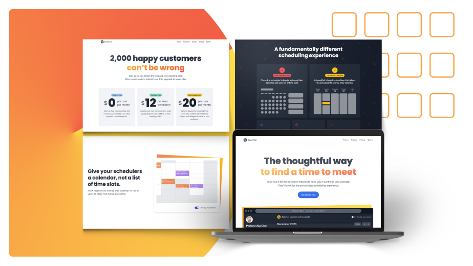
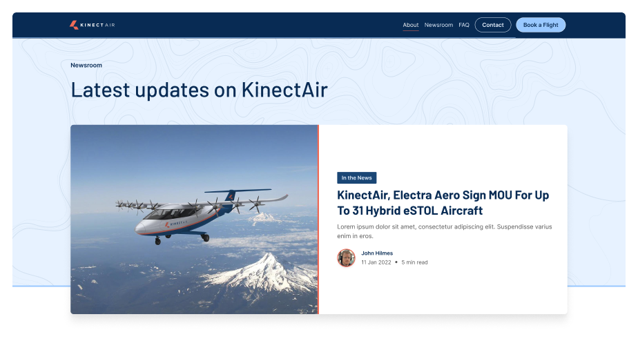
Join It is a member database management product. Two-time client of ours: first engagement in 2023, second in early 2025. The page we'll walk through is one of their feature pages.
The brand has a specific challenge baked in: their primary color is peach. Anything on the hot end of the color wheel — red, orange, yellow, peach — is genuinely hard to design with. It carries emotional weight (peach reads slightly negative on text, just like red does), it fights body copy for attention, and it locks you out of the conventional design pattern where you'd use a warm tone for negative states.
That single constraint shaped most of the decisions on the page.
Tactic 1: Stop centering everything
The single most common mistake we see on founder-designed feature pages: a centered column of rich text, paragraph after paragraph, with a feature screenshot dropped underneath. It feels safe. It feels organized. It also feels like a blog post, which is exactly the wrong reference for a feature page.
There's a defensible reason founders end up here. Search engines reward pages with substantive text, so cramming everything into a single rich-text block looks like it's "getting the SEO benefit." But that's a misread. You can have the same amount of indexable text on the page and still organize it into a proper visual hierarchy with sections, sidebars, callouts, and supporting visuals. The SEO benefit doesn't depend on the centered-column layout. It depends on the words being there.
How to apply it: Audit every feature and product page. If the body content is rendered as a wall of centered paragraphs, you have rich-text-block syndrome. Rebuild as a structured page: section headers, two-column layouts, anchored visuals, callout boxes. The text stays. The container changes.
Tactic 2: Use eyebrow + vanity headline + H1 structure
This is the heading pattern we use on almost every Conversion Factory-designed page now. Three pieces stacked vertically above the fold:
- Eyebrow (also called the vanity headline) — small text, sits above the main headline, often labels the feature or category. Something like "MEMBER DATABASE" in caps.
- Main headline (H1) — the searchable, benefit-driven phrase. This is where your primary keyword goes.
- Subheading (H2) — the longer hook. Where you explain who it's for and what they get.
The mistake we see: founders use the feature name itself as the H1 (e.g., "Member Database"). That eats the most valuable real estate on the page on something that should be a small label. Use the eyebrow for the name. Use the H1 for the benefit-coded phrase a buyer would search. Use the H2 to extend the value prop.
This isn't just aesthetic. It changes what the page can rank for and what the visitor reads first.
For the SEO side of this — why H1/H2/H3 hierarchy matters for ranking and how to wire it up properly — read our deeper breakdown in H1, H2, H3 for SEO: Why Most SaaS Sites Get Heading Hierarchy Wrong.
How to apply it: Pull up any feature page where the headline is the feature name. Demote the feature name to an eyebrow. Promote the benefit phrase (with the searched keyword in it) to H1. Add a meaningful H2 underneath that extends the promise.
Tactic 3: Anchor extended copy with a visual on the right
When your above-the-fold section has enough copy that it extends past the visible area on a laptop, a centered or stacked layout starts to feel heavy. The visitor sees text, more text, and then has to scroll to find anything visual.
The fix: put the copy on the left and a visual on the right. Product screenshot, abstraction, illustration — something that gives the eye somewhere to land. If your copy is shorter and fits naturally, a stacked layout with the visual underneath is fine. The decision is about whether the copy length forces a layout problem you need to solve.
How to apply it: Measure your H1 + H2 + supporting paragraph above the fold. If it visibly extends past the fold or feels heavy, switch to a two-column layout: copy left, visual right.
Tactic 4: Use scrolling logo libraries for social proof
Social proof is non-negotiable on a SaaS landing page, but most founders treat it as a single static row of logos. That works, but it commandeers a lot of vertical real estate to display six logos.
Better pattern: a scrolling logo strip — logos slide in from the right and continuously cycle. Same vertical space, but you can fit 12–20 logos in the rotation, and the motion catches the eye in a way that a static row doesn't. Most modern CMSes (Webflow, Framer, custom) have a "marquee" or "ticker" component that does this in two clicks.
How to apply it: Replace static logo rows with a scrolling strip. Add every recognizable customer logo to the rotation, not just the top six.
Tactic 5: Never use hot brand colors for headline text
This is the rule that saved Join It's page. Their primary brand color is peach. Setting their H1 in peach felt on-brand, but it failed two ways:
- Accessibility. Peach on white doesn't hit WCAG contrast ratios. The headline becomes hard to read for anyone with visual impairment, hard to read in bright light on a phone, and hard to read for everyone after five seconds.
- Emotional valence. Anything on the hot side of the color wheel — red, orange, yellow, peach — carries a slightly negative emotional connotation in body text. Look at how Airbnb and Target use their brand red. They use it as branding (logos, accent buttons, callouts) but almost never as headline or body text. The headline is dark gray or black. The brand color shows up as an accent, not as the primary text color.
Your brand color is for branding moments. Your text color is for legibility.
How to apply it: Audit every headline on your site. If any headline is set in a primary brand color that's red, orange, yellow, peach, or pink, change it to a high-contrast neutral. Move the brand color to accent elements: buttons, badges, eyebrow text, icon fills.
Tactic 6: Auto-playing video beats static images
If your hero section currently has a single product screenshot, replace it with a short auto-playing video. Even a 5-second loop showing the product in motion is dramatically more clickable than a static screenshot.
The reason isn't novelty. It's the cue. A playing video signals "there's something to engage with here" in a way that a screenshot can't. Visitors who would have skipped the screenshot will click into a video. From there, you have their attention for whatever the video actually shows.
This is the difference between hero sections that get 2% engagement on the visual and ones that get 15%+.
How to apply it: Take the single most important screenshot on your hero. Reshoot it as a 5–10 second loop showing the key interaction. Set it to auto-play, muted, looped. Replace the screenshot. Watch the engagement metric on that element.
Tactic 7: Contrast without red — the before/after section trick
Before-and-after sections are one of the highest-converting patterns on a SaaS landing page. The setup is universal: left side shows the pain (red color, frustrated tone). Right side shows the solution (green color, calm tone). Visitors get the contrast at a glance.
But what do you do when your brand color is red, orange, yellow, or peach? Coloring the "before" section red would mean using your own brand color to signify the bad state. That's a brand confusion.
The move: skip color entirely on the "before" side. Make it neutral. Gray background, gray text, no accent color at all. Then the "after" side uses your brand color for the positive state. The contrast still lands — neutral feels boring and stuck, branded feels alive and resolved — but you've protected your brand color from carrying negative emotional weight.
This is the same neutral-to-branded contrast pattern we used on the Conversion Factory homepage when we wrote about marketing lessons from Lord of the Rings and the competitor comparison page format. Same idea applied to a different page type.
How to apply it: If your brand color is on the hot side of the wheel, audit any before/after, problem/solution, or pain/gain section on your site. Strip the color from the "before" side. Let the absence of color do the work.
Case study 2: Lyon — brand foundation and grid discipline
Lyon is a product quality studio. They run analysis and testing on products before release so founders catch bugs and UX regressions before they ship. The redesign challenge was different from Join It's. Their previous site had vision — they were going for elegance, and you could see it — but the execution was undisciplined. Too many colors, weak typographic hierarchy, inconsistent treatment of branding assets.
Before we touched the website, we rebuilt the foundation: new logo mark, refined typography, tightened color palette. That foundational work is what made the site redesign work. You can't conversion-optimize your way out of a brand that doesn't have a coherent visual identity.
This second case study is more about brand foundation than tactical CRO. But the foundation is what every tactical move on Join It's site depends on.
Tactic 8: Earthy neutrals beat blinding white
Most SaaS websites default to pure white backgrounds. Pure white is the safest choice — it never clashes with anything — but it also creates a specific aesthetic problem: it's blinding. Stare at a pure-white SaaS site for two minutes and your eyes start fatiguing. Worse, every SaaS site looks the same when they all use the same white.
On Lyon, we used a warm light gray as the primary background. Earthy. Lower contrast than pure white. The page feels softer, more considered, more like a designed object than a default template. It also lets the brand colors — green, muted secondaries — sit more naturally on the page without screaming.
This is a "feels designed" move more than a measurable conversion move. But the cumulative effect of a page that feels designed shows up in time-on-page, brand recall, and the implicit signal of credibility.
How to apply it: If your site's primary background is pure white (#FFFFFF), consider a warm or cool light gray instead (#FAFAF8, #F8F9FA, #F5F4F0). It's a one-token change in your design system that affects the entire feel of the brand.
Tactic 9: Pair typefaces with intention
Lyon's redesign uses two typefaces: Cormorant Garamond for headings and Outfit for body. They pair well because they contrast on every axis that matters — serif vs sans-serif, high-contrast vs uniform stroke, elegant vs neutral — while staying readable at every weight.
The reason most SaaS sites have weak typography isn't that the typefaces are bad. It's that the typefaces aren't paired. A single typeface used for everything reads as default. A heading face that's just the body face at a larger size reads as default. The visitor's eye doesn't separate hierarchy because there's no hierarchical signal in the type itself.
The pairing rule: pick two typefaces that contrast meaningfully. Serif + sans-serif is the safest pairing. Two sans-serifs with very different feels (e.g., a geometric vs a humanist) works too. Avoid pairing two similar serifs or two similar sans-serifs — that's where the "I can't tell what's different about this site" feeling comes from.
How to apply it: Audit your current typography. If you're using one typeface for everything, add a second face for headings. Pick something that contrasts. Run it through your hero, feature pages, and blog index. The hierarchy should suddenly become obvious.
Tactic 10: Strict grid adherence is the foundation
The single biggest visual upgrade in Lyon's redesign wasn't a specific color or font — it was that every element on every page snaps to the same grid. Headings align with body text below them. Cards align with each other. The footer aligns with the header. Section padding is consistent across all sections.
This sounds obvious. It isn't. Most founder-built SaaS sites have grid drift everywhere. A hero section uses one container width. The features section uses a slightly different width. The pricing table breaks out of the grid because it didn't fit. Each section was built independently, and the cumulative effect is a page that feels improvised even when individual sections look fine.
A grid isn't a layout. It's a discipline. Pick column count (12 is standard), pick gutters, pick container max-width, and then refuse to break any of those rules. If a section doesn't fit, redesign the section — don't break the grid.
The payoff is that every page feels cohesive. The visitor never consciously notices the grid, but they feel the difference between a site that has one and a site that doesn't.
How to apply it: Define your grid (column count, gutter, max-width) and audit every page against it. Every section that breaks the grid is a redesign target. This is unglamorous work that compounds. Six months of grid discipline produces a site that feels designed in a way no individual tactic can.
Tactic 11: Humanist illustrations soften the geometry
Grids are sharp. Typography is precise. The default state of a disciplined SaaS site is geometric, austere, and slightly cold.
The counterweight: humanist illustrations. Hand-drawn-feeling line work, characters that don't look like they came from a stock illustration pack, organic forms that break up the rigid columns. Lyon's site uses illustration sparingly — they're not the primary visual content — but where they appear, they soften the page and signal "this is a brand with personality."
The mistake here is overcorrecting. Don't fill your site with illustrations to "add warmth." That swings into illustration-heavy template-y territory. Use illustrations as accents at intentional moments: an empty state, a section header, a sidebar callout. One or two per page, max.
How to apply it: If your site is grid-disciplined and feels cold, commission 3–5 custom illustrations from an illustrator whose style matches your brand. Use them sparingly. The contrast between the geometric layout and the organic illustration is the point.
The thread connecting both case studies
Join It and Lyon look like different design problems on the surface. Join It was about fixing tactical mistakes on a feature page. Lyon was about laying brand foundation. But the underlying principle is the same on both: most SaaS websites lose conversion because nobody questioned the defaults.
Centered rich text is the default. Hot brand colors in headlines is the default. Static screenshots is the default. Pure white background is the default. Single-typeface typography is the default. Improvised grids are the default.
A high-converting SaaS website is just one where someone went back through every default and asked: is this the right call for this brand, this audience, this page? Most of the time, the answer is no. The work is in the rebuild.
If you're staring at your own site and seeing some version of every problem in this post, that's not unusual. Almost every SaaS site we redesign at Conversion Factory has at least five of these eleven issues. The good news: each one is a discrete fix. Pick the worst three, fix them, ship. Then pick the next three.
The Lyon redesign treatment usually maps to a deeper engagement — brand foundation work, then site rebuild. If you want to see that level of system thinking applied to your brand, look at our rebranding strategy framework for when full-system work is the right call versus targeted fixes.
FAQs
What's the difference between SaaS website design and regular website design?
The core principles are the same — hierarchy, contrast, grid, typography — but SaaS imposes specific constraints that change the calculus. SaaS pages need to surface a product (which usually means video or interactive demo above the fold), need to convey ongoing value (not a one-time purchase), need to convert at multiple buyer-journey stages on the same page, and need to do all of this fast because acquisition cost is high. A "regular" small business site can sometimes get away with brochure-style design. A SaaS site can't.
How long should a SaaS website redesign take?
For a focused feature-page redesign like Join It's, two to three weeks from kickoff to launch is reasonable. For a full brand foundation plus site rebuild like Lyon's, eight to twelve weeks is the realistic range — brand foundation is two to three weeks on its own, and the site build can't start until the foundation lands. Anyone quoting a full SaaS site redesign in under four weeks is either skipping the strategy work or working from a template.
Is custom design worth it for a SaaS site, or should I use a template?
Templates are fine for the first six to twelve months when you're validating a market. Once you have product-market fit and you're scaling acquisition spend, every percentage point of conversion rate is worth real money, and the template ceiling becomes the bottleneck. The shift from "template that works" to "custom site that converts" usually pays back within the first quarter once your traffic is meaningful.
Should I hire a designer or use AI design tools for my SaaS site?
AI design tools are useful for individual assets (illustrations, icons, copy generation) but not for end-to-end site design. The hard part isn't producing pixels — it's the strategic decisions: which features get hero placement, what headline structure ranks for which keyword, how to handle a hot brand color, where to apply grid discipline. Those decisions require taste and judgment that AI tools don't have yet. Use AI to accelerate execution. Hire humans for strategy.
How do I know if my current SaaS website needs a redesign?
Three signals. First, your conversion rate from organic traffic to trial signup is under 2% — most well-designed SaaS sites land between 3% and 6%. Second, you can point to specific feature pages that haven't been touched in twelve months but are getting traffic. Third, your homepage looks like every other SaaS site in your category. Any one of those is enough to trigger a redesign conversation. All three is a red alert.
What's the most important first move if my budget only allows one fix?
Above-the-fold hierarchy. Specifically: fix your H1, H2, and primary visual on the homepage. That single section is what 80%+ of new visitors will judge your site on, and it's the lowest-effort highest-impact change you can ship. New H1 with the searched keyword and benefit phrase. New H2 that extends the value prop. Replace static hero image with a short auto-playing product video. Three changes, one week of work, measurable lift.